Finding Beauty in the Unexpected
Title: Held Within the Field
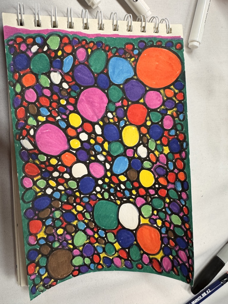
Artist Statement

This piece emerged through repetition rather than planning. I began with a single shape, then another, and another, allowing colour and form to accumulate without imposing hierarchy. What developed was a dense field of rounded figures, each contained, each distinct, yet held within a shared space. The work unfolded beyond linear intention, through a quiet attentiveness to what wanted to appear.

In my reflective practice, circular and stone-like forms often surface when I am thinking about belonging, plurality, and the coexistence of emotional states. No single shape dominates the composition. Larger forms draw the eye momentarily, but they are held in balance by the many smaller presences surrounding them. This distribution mirrors how experience lives within me. No one memory or feeling stands alone. Each is shaped by proximity to others.

Colour operates here as emotional register. Bright pinks, deep blues, citrus orange, moss greens, and earth tones sit beside one another without blending. They remain intact, suggesting that complexity requires no resolution. Contradictory feelings can exist simultaneously without cancelling one another out. The dark outlines serve as holding structures, containers rather than barriers, allowing each fragment to remain visible while contributing to the whole.

What interests me most is the tension between density and spaciousness. Although the surface appears crowded, there is rhythm in the placement. Pathways of dark ground weave between the forms, creating movement and breath within the field. The composition holds fullness without collapse.

I understand this drawing as an exploration of internal multiplicity. A recognition that identity is plural rather than singular, gathered, layered, and continuously reassembled. Each form holds its own colour, its own boundary, its own story. Together, they create a living mosaic of presence.

Photo Credit: Amy Tucker, 2026
The Flash of Perception
I almost walked past it. An orange, vivid and whole, resting on the dry earth as if it had been placed there by intention rather than chance. The ground around it was grey and brown, scattered with stones, dried grass, and brittle leaves. The orange held its colour like a small act of defiance. It did nothing to blend in. And yet here it was, this bright sphere of sweetness against a landscape of dust and stillness.
The orange held its colour like a small act of defiance.
This is the moment contemplative photographers call the flash of perception: that instant when something in the visual field stops you, interrupts the continuous scroll of seeing, and asks to be noticed. Karr and Wood (2011) describe this experience as connecting with perception before concept takes over, before the mind labels and dismisses. The orange was simply colour and form before it became orange, before it became a question of how it arrived or what it might mean.
This is the moment contemplative photographers call the flash of perception.
Me detuvo en seco. It stopped me cold. And in that stopping, I recognised something I had been missing in my practice of alonetude: the permission to see in colour.
I recognised something I had been missing in my practice of alonetude: the permission to see in colour.
Title: Sweetness in Dust
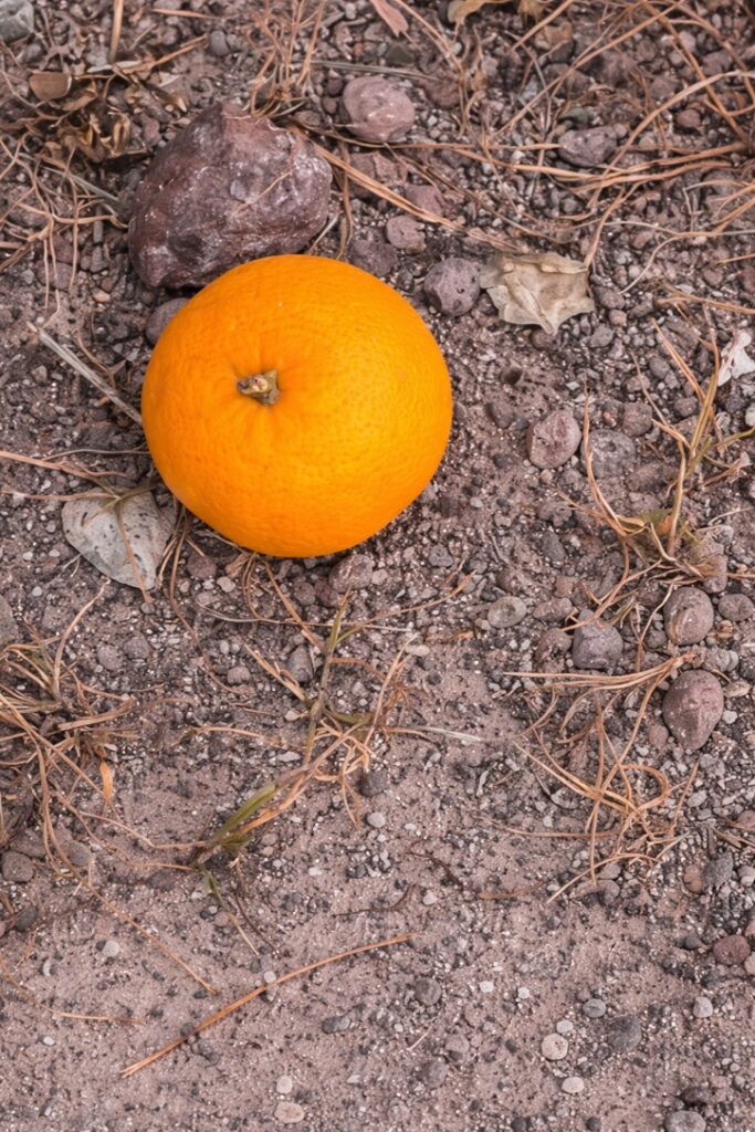
Artist Statement

The orange arrived without explanation. Perhaps it fell from a bag. Perhaps it rolled from a table and was never retrieved. Perhaps someone left it as an offering, though to whom or what I cannot say. The fruit showed no sign of decay. Its skin was smooth, its form intact. Its slow return to the earth had yet to begin. For now, it simply rested, bright and round, waiting for what would come next. This is the only photograph in my collection that I have kept in colour. The choice was deliberate. In a body of work committed to black and white, to reduction and restraint, this image demanded something different. The orange refused to be muted. Its brightness was the point. To convert it to greyscale would have been to erase what made the encounter remarkable: the unexpected presence of sweetness in a landscape of dust and stillness. Amy Tucker, January 2026
I moved closer. This is what contemplative practice asks of us: to stay with what stopped us, to look longer, to resist the urge to glance and move on. The closer I came, the more the orange revealed. The texture of its skin. The small star where the stem once attached. The way light fell across its curved surface. In my years of academic work, I learned to keep distance, to analyse from above, to maintain the scholarly remove that institutions reward. This practice of moving closer feels like unlearning. The orange cares nothing about my credentials or my theoretical frameworks. It simply exists, vivid against volcanic pebbles, asking nothing of me except presence. Acercarme es un acto de confianza. Moving closer is an act of trust.
In my years of academic work, I learned to keep distance. This practice of moving closer feels like unlearning.
Defining Key Concepts
The decision to notice the orange was beyond me. My body responded before my mind caught up.
Visual Salience
Title: Fractures That Hold Light
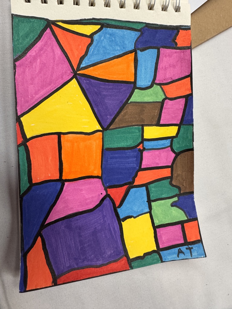
Artist Statement

This drawing began as an exploration of fragmentation. I was thinking about how experience rarely arrives in seamless form. Instead, it presents itself in angles, interruptions, and shifting planes. I allowed the lines to move first, creating divisions that felt organic rather than measured. Only afterward did colour enter, filling the spaces that had already claimed their boundaries.

What emerged was a stained-glass effect, though untied to any sacred architecture. The sacredness here feels internal. Each segment holds its own intensity. Bright yellows sit beside deep violets. Saturated pinks meet earth browns and dense blues. The colours resist blending. They remain intact, suggesting that contrast is coexistence rather than conflict.

In my reflective practice, fractured compositions often mirror psychological landscapes. Identity, memory, and healing rarely unfold as continuous surfaces. They exist in pieces that must learn to sit beside one another. Some segments feel expansive and open. Others feel enclosed, heavier, or more opaque. Yet all are necessary to the integrity of the whole.

The black lines function as both separation and structure. They divide, but they also hold. Without them, the colours would dissolve into each other. With them, each fragment is given legitimacy, a defined presence. I understand these lines as boundaries that have formed through experience. Protective, clarifying, and sometimes shaped by rupture rather than design.

There is no single focal point. The eye moves continuously, tracing edges, following colour pathways, pausing where intensity gathers. This movement reflects the ongoing nature of integration. Healing is a sustained process of learning how the pieces live together.

I see this work as a meditation on wholeness assembled through fracture. A recognition that brokenness rearranges beauty rather than eliminating it. Light enters differently through divided spaces. And sometimes, it is precisely the fractures that allow illumination to pass through at all.

Photo Credit: Amy Tucker, 2026
Visual salience refers to the quality that makes certain elements in a visual field stand out from their surroundings and automatically capture attention. Neuroscience research shows that the human visual system has evolved to detect stimuli that differ markedly from their context, particularly in colour, contrast, and luminance (Treue, 2003). When we encounter a bright orange against a field of browns and greys, our nervous system responds before conscious thought engages. This bottom-up attention capture served evolutionary purposes, helping our ancestors detect ripe fruit, potential predators, and social signals.
The decision to notice the orange was beyond me. My body responded before my mind caught up.
What fascinates me about this phenomenon is how it operates beneath the surface of awareness. The decision to notice the orange was beyond me. My body responded before my mind caught up. This is what Porges (2011) describes in Polyvagal Theory as neuroception: the nervous system’s capacity to evaluate environmental cues without conscious involvement. In the context of healing from occupational trauma, relearning to trust these automatic responses feels like reclaiming territory that exhaustion had claimed.
Contemplative Photography
Contemplative photography is a practice that uses the camera as a tool for mindful seeing rather than technical image-making. Originating in Buddhist meditation traditions and systematically developed by Chögyam Trungpa Rinpoche’s students, this approach emphasises presence over perfection, perception over concept. Karr and Wood (2011) explain that the practice involves three stages: recognising the flash of perception, stabilising connection through continued looking, and forming an image that captures what was seen rather than what the photographer wanted to see.
The root meaning of the word contemplate is connected with careful observation. It means to be present with something in an open space. When we contemplate a subject, we open to it rather than treating it as something to be analysed or understood. (Karr & Wood, 2011, p. 5)
This definition resonates deeply with the practice of alonetude. To be present with something in an open space is precisely what this retreat asks of me: to remain in the liminal territory between loneliness and solitude, to transform imposed isolation into chosen presence through attention itself.
Playing with Bright Colours: A Departure
Throughout this retreat, I have committed to black-and-white photography, to reduction and restraint, to the greyscale palette that strips scenes down to their essential forms. This choice emerged from the desire to document exhaustion, aftermath, and the quiet work of healing without the distraction of colour’s emotional pull. Black-and-white photography creates distance, allows objects to become symbols, and privileges texture and contrast over the seduction of hue.
And yet.
Walking through Loreto, I found myself stopped again and again by colour. Bright, saturated, unapologetic colour that refused to be muted even in my imagination. The red of a plastic cup abandoned among grey leaves. The crimson of a painted butterfly on a white stone. The vivid orange of bougainvillea against ancient rock. The cheerful red of a classic Volkswagen Beetle parked on a quiet street. These colours were asking something of me, and what they asked was this: to let go, just a little, of the aesthetic framework I had imposed. To allow brightness back in.
El color también es una forma de conocimiento. Colour is also a way of knowing.
Title: Party’s Over
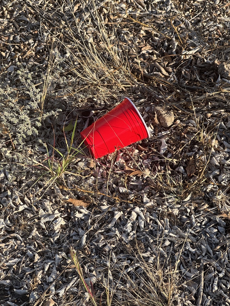
Artist Statement

I know this cup. I have held this cup at faculty gatherings, at end-of-term celebrations, at the casual socials that punctuated academic life before everything changed. The red Solo cup is North American shorthand for festivity, for letting loose, for the brief suspension of professional performance. Finding one here, among the grey leaves and brittle grass of a Loreto afternoon, felt like encountering an artifact from another life. Someone celebrated here. Someone gathered with others, drank something, discarded the evidence. The cup remains, cheerful and incongruous, long after the party ended. I photograph it because I recognise both the celebration and the aftermath. Because I am learning that endings leave traces, and sometimes those traces are bright red against a field of grey. Because the cup, like me, persists in a landscape that was never quite its home. Photo Credit: Amy Tucker, January 2026
Title: Someone Else’s Transformation
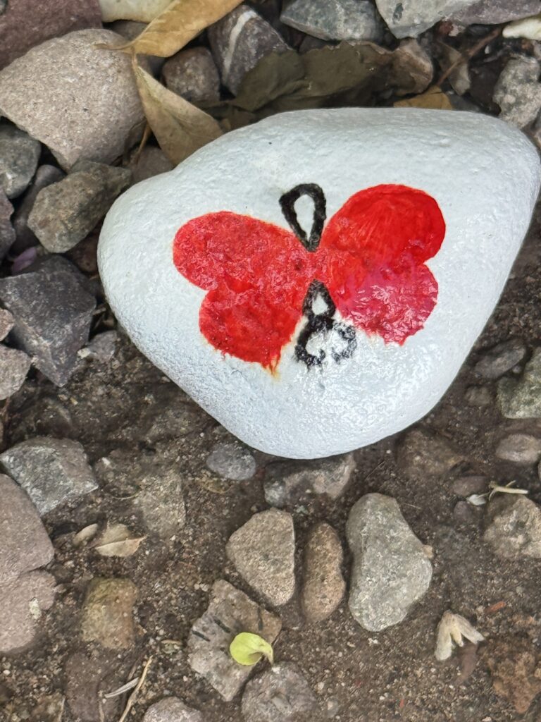
Artist Statement

I have been painting stones throughout this retreat, transforming found objects into small monuments of presence and process. This stone was painted by someone else. I found it resting among grey pebbles, its white surface marked with a red butterfly, wings spread as if caught mid-flight. The butterfly is imperfect. The paint has texture and variation. This was made by hand, by a person who chose to mark this stone with a symbol of transformation and left it here for anyone to find. No estoy sola en esta práctica. I am alone in my practice, yet hardly the only one who practices. Somewhere in Loreto, or passing through, someone else felt the impulse to transform stone into meaning. Someone else left evidence of attention, of care, of the quiet human need to make marks on the world. I photograph this stone because it reminds me that alonetude connects to a larger community of those who attend, who notice, who create small beautiful things and release them into the world. Photo Credit: Amy Tucker, January 2026
Global Red
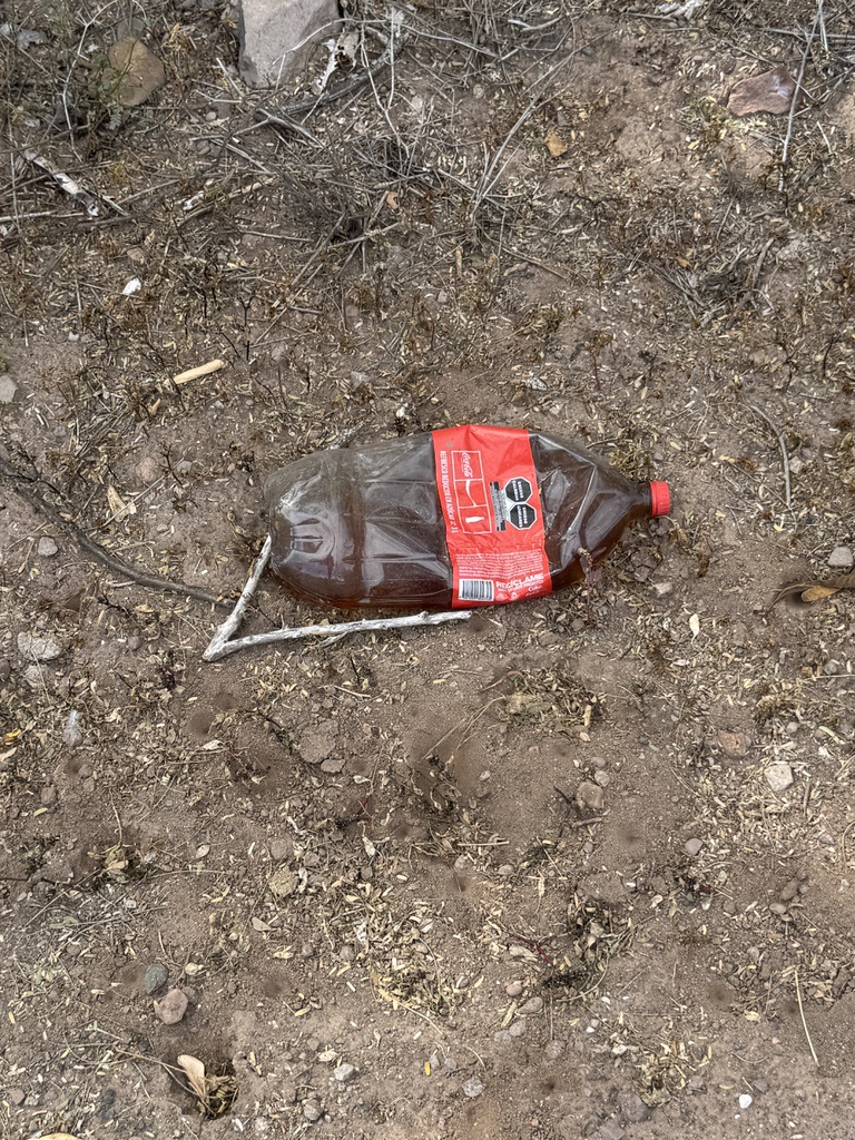
Artist Statement


The red of the Coca-Cola label is engineered to be seen. Billions of dollars and decades of research have ensured that this particular shade of red captures attention in any context, any culture, any landscape. Here it lies, crushed and discarded on dusty earth, still vivid, still demanding to be noticed. I have complicated feelings about photographing corporate debris. There is critique here: the reach of globalised consumer culture, the persistence of plastic in natural environments, the way branded objects colonise every corner of the world. And there is also simple visual truth: the red is beautiful against the brown. The bottle, for all it represents, still stopped me. Still asked to be seen. In my practice, I try to hold both truths. The systems that produce such objects are worthy of critique. The objects themselves still carry colour, still participate in the visual world, still have something to teach about persistence and salience and the stubborn brightness of things that refuse to disappear. Photo Credit: Amy Tucker, January 2026
Title: What the Land Offers
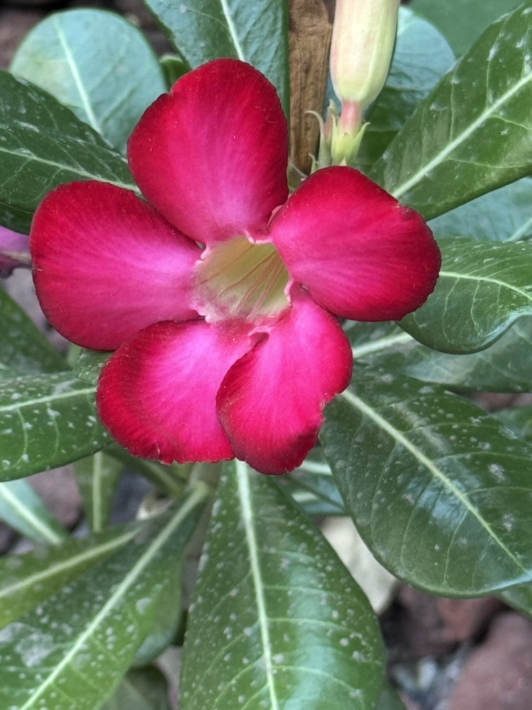
Artist Statement

Unlike the cup, the bottle, the painted stone, this colour emerged from the land itself. Bougainvillea evolved its crimson bracts to attract pollinators, to ensure reproduction, to continue its lineage across generations. The red serves biological purpose. It exists because it works.

Against the grey stone of a Loreto wall, the flowers blazed with the kind of beauty that requires no justification, no theoretical framework, no scholarly analysis. They were simply, extravagantly, themselves.

I photograph them because they remind me that colour is older than human culture, that attention capture served survival long before it served commerce, that beauty has reasons we may never fully understand. La tierra también sabe crear belleza. The land also knows how to create beauty. In the practice of alonetude, where I am learning to trust my body's responses, these flowers offer evidence that brightness is natural, that noticing what is vivid is coded into the very structure of perception. Amy Tucker, January 2026
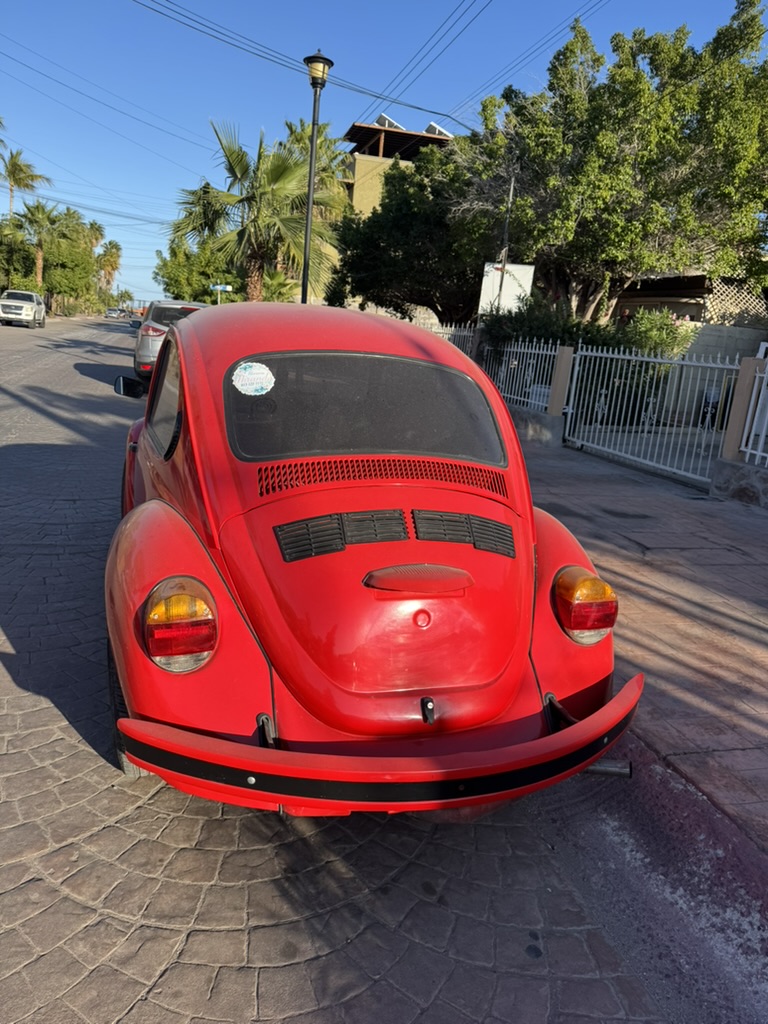
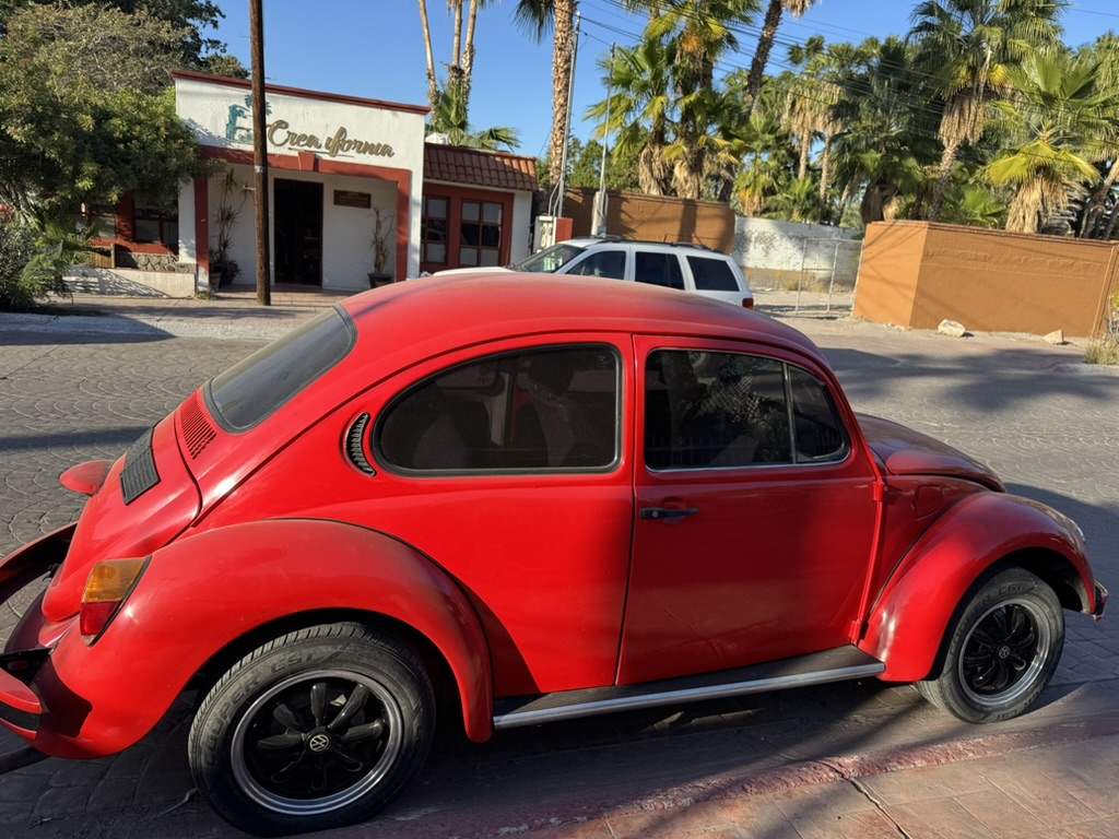
El Vocho Rojo: The Red Beetle
On a quiet street in Loreto, a red Volkswagen Beetle sat in the afternoon light like something from another decade. In México, these cars are called vochos, and they carry cultural significance beyond their mechanical function. For decades, the Beetle was the affordable, reliable car that connected communities, carried families, and moved through landscapes with a particular personality that contemporary vehicles somehow lack.
This one was red. Very red.
This one was red. Very red. Its colour commanded attention against the palm trees and blue sky, against the dusty street and white buildings. I photographed it twice: once from behind, its rounded form echoing the organic shapes of the oranges I had noticed elsewhere, and once from the side, showing its classic profile and the wear of years in a desert climate.
Hay belleza en lo que ha durado. There is beauty in what has endured.
Title: El Vocho: From Behind
Amy Tucker, January 2026
Artist Statement

From behind, the Beetle's curves echo something organic. The rounded rear window, the gentle slope of the body, the way light plays across the painted surface. There is a face-like quality to this view, though I resist the urge to anthropomorphise. What strikes me instead is the car's solidity, its thereness, its quality of having persisted. This vocho has lived through decades of Baja California sun. Its red has faded slightly but remains vivid. Its form remains classic, recognisable, beloved. I photograph it because I am thinking about persistence, about what remains bright despite time and exposure, about the objects that carry cultural memory in their very shape. In my own life, I am learning what persists after institutional belonging ends. What colours remain when the context changes. What shape I hold when the structures that once defined me fall away. The vocho offers no answers, only presence: still red, still here, still beautiful after all these years. Photo Credit: Amy Tucker, January 2026
El Vocho: Profile of Persistence
Artist Statement

Amy Tucker, January 2026

The side view reveals the Beetle's full profile: the distinctive silhouette that made it one of the most recognizable vehicles in history. Behind it, a building bears the words "Creo California," anchoring the scene in this place, this Baja California Sur afternoon. The car shows its age here.

Small imperfections, the patina of desert years, the evidence of continued use rather than museum preservation. This is a working vehicle, loved and maintained, still serving its purpose decades after it rolled off the assembly line. I see myself in this persistence. I am also showing my age, carrying my patina of difficult years, bearing the evidence of continued use. The vocho neither apologises for its imperfections nor hides its history. It simply continues, red and present and itself. Seguir adelante también es una forma de belleza. To keep going is also a form of beauty. Photo Credit: Amy Tucker, 2026
Table 1
Colour Instances and Their Personal Resonances
| Image Title | Visual Element | Personal Connection |
| Connection to my own stone-painting practice; recognition that alonetude links to the larger community; shared impulse to create | Orange fruit on dry earth | Permission to see in colour; the flash of perception that initiated this collection; trusting automatic responses |
| Closer Still | Orange in close-up view | Unlearning scholarly distance; moving closer as an act of trust; presence over analysis |
| Party’s Over | Red plastic cup among leaves | Recognition of academic celebrations past; understanding endings leave traces; persistence after displacement |
| Someone Else’s Transformation | Painted butterfly stone | Connection to my own stone-painting practice; recognition that alonetude links to larger community; shared impulse to create |
| Global Red | Crushed Coca-Cola bottle | Holding critique and beauty simultaneously; learning to acknowledge complicated truths; seeing persistence in the problematic |
| What the Land Offers | Crimson bougainvillea | Trusting embodied responses; remembering colour is natural; beauty that requires no justification |
| El Vocho | Red VW Beetle | What persists after context changes; carrying patina with dignity; keeping going as a form of beauty |
Note. This table maps each image to its visual content and the personal resonances that emerged through the practice of contemplative photography within the alonetude framework.
Reflection: What Colour Asks of Us
Permission to notice joy even in landscapes of recovery. Permission to be stopped by beauty that has nothing to do with achievement or productivity. Permission to let the eye rest on something simply because it delights.
Greenspan (2003) writes about befriending dark emotions as pathways to wisdom. But what of bright colours? What do they ask when they interrupt our carefully curated palette of greys and browns, of exhaustion and restraint? I think they ask for permission. Permission to notice joy even in landscapes of recovery. Permission to be stopped by beauty that has nothing to do with achievement or productivity. Permission to let the eye rest on something simply because it delights.
The graced eye can glimpse beauty everywhere, seeing the divine at work in the hidden depths of things. The eye of aesthetic spirituality sees more than other eyes. (Paintner, 2013)
These photographs hold a tension I am learning to inhabit: between my commitment to black-and-white documentation and the insistence that colour be seen. Both truths are real. Restraint has its purpose. And brightness has its own knowledge to offer. In the practice of alonetude, perhaps both are necessary. The greyscale for processing what has been lost. The vivid hue for remembering what remains.
I photographed the orange because I could neither look away nor imagine it in greyscale. I kept it in colour because some things ask to be seen exactly as they are. And in doing so, I gave myself permission to notice that healing includes brightness, that recovery holds room for delight, that even in the labour of alonetude, something sweet and vivid can rest on the ground, waiting to be found.
La belleza existe. Existe aquí. Existe ahora.
Beauty exists. It exists here. It exists now.
Some things ask to be seen exactly as they are.
References
Greenspan, M. (2003). Healing through the dark emotions: The wisdom of grief, fear, and despair. Shambhala.
Itti, L. (2007). Visual salience. Scholarpedia, 2(9), 3327. http://www.scholarpedia.org/article/Visual_salience
Karr, A., & Wood, M. (2011). The practice of contemplative photography: Seeing the world with fresh eyes. Shambhala.
Paintner, C. V. (2013). Eyes of the heart: Photography as a Christian contemplative practice. Sorin Books.
Pink, S. (2013). Doing visual ethnography (3rd ed.). SAGE.
Porges, S. W. (2011). The polyvagal theory: Neurophysiological foundations of emotions, attachment, communication, and self-regulation. W. W. Norton.
Treue, S. (2003). Visual attention: The where, what, how and why of saliency. Current Opinion in Neurobiology, 13(4), 428-432. https://doi.org/10.1016/S0959-4388(03)00105-3
Translation note. Spanish language passages were generated using Google Translate and subsequently reviewed and refined by the author. Any remaining infelicities reflect the limits of machine translation rather than intent.